Creative Teams
November 4, 2025
Unlocking Product Integration in Generated Images in Pencil
# Creative inspiration
# Nanobanana
# Image generation
How to make the product belong

Juliette Suvitha
Getting product fidelity right in GenAI is like teaching a magician to be an engineer. You want the illusion, but you also want the physics to hold up. When the product looks off, when the shadows don’t align or the surface feels wrong, the whole story collapses. People notice the fake before they feel the real.
That’s why we started playing with Nano Banana, integrated into Pencil for product integration.
The goal is simple: make the product belong.
In this short case study, I’ll show how we tested Nano Banana across categories: skincare, cosmetics, fashion, jewellery, alcohol, and cars to see how it holds up, what it struggles with, and what creative teams can do to push fidelity further. There’s even a little surprise comparison at the end with Veo 3.1 and Sora 2, just to see how the newcomers stack up.
The Fidelity
Prompt: A beauty serum bottle takes center focus on a clean bathroom counter, styled with a soft lavender towel folded nearby. The surface is light marble, and the background shows a pastel-colored bathroom with subtle pink and purple hues, softly blurred. Shot using a 50mm lens at f/2.0 to create creamy bokeh and isolate the product. The lighting is bright yet diffused morning daylight coming from a window, casting warm natural shadows and enhancing the fresh, calming atmosphere. The product is lit to highlight its soft sheen and purple-toned packaging, in line with Aura Cosmetics’ elegant and gentle visual identity. | We used Nano Banana to see how well it could read tone, material, and light from the original product. The result was close. The AI placed the bottle into a soft, pastel environment that felt right for the brand. The light fell naturally, and the marble surface added just enough reflection to make it believable. Score: 7/10 Good lighting direction does half the work. When the prompt clearly defines temperature and softness, the product blends in almost perfectly. Lighter packaging needs care, too much exposure and you lose contrast in the logo. For glass droppers, it helps to ask for “clear reflections and realistic transparency.” Nano Banana works best when you guide it like a photographer, not a prompt engineer. | 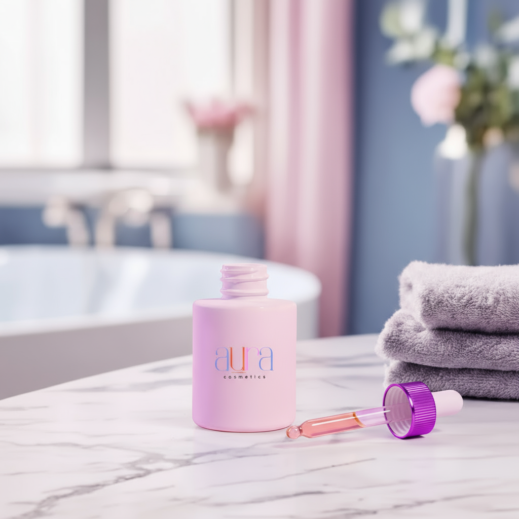 Product Shot: 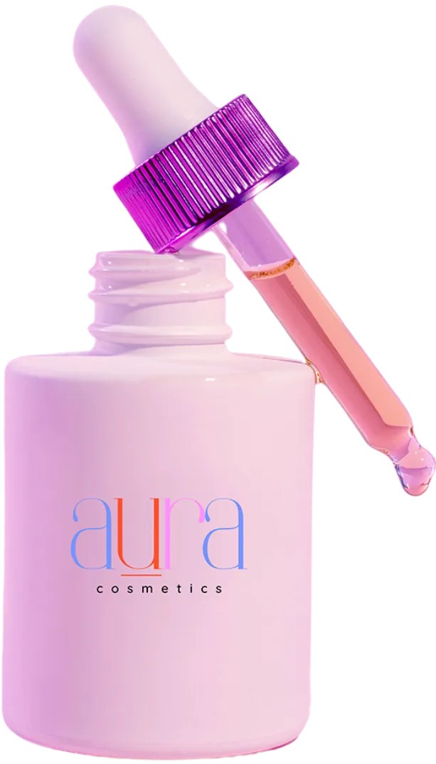 |
Prompt: A cozy vanity tabletop styled in Racelle’s signature golden-hour palette — warm beige, creamy taupe, and soft caramel tones — with sunlight spilling across the surface. A set of makeup brushes lies gently scattered, angled casually to feel lived-in yet elegant. A round tabletop mirror sits in the background, catching subtle reflections, while diffused studio lights softly glow in the blurred distance, creating a sense of refined intimacy. Shot from a 35mm lens at f/2.8 to preserve depth and detail across the objects. Lighting is warm, natural golden daylight from a side window, bouncing off textures like brushed metal, leather, and satin finishes, to echo the polished yet relaxed visual world of Racelle Cosmetics. | This test was all about balance - warmth, light, and texture. And Nano Banana handled it with care. The palette sits beautifully within the scene, catching golden tones that match Racelle’s brand aesthetic. The palette feels at home among the props, with believable shadows and subtle metallic highlights. The background blur adds that cinematic warmth you get from natural light on satin textures, and the mirror reflections give the space quiet realism. Score: 8/10 Metallic and matte finishes can coexist beautifully when the light is right. Nano Banana read the materials and light falloff well, especially the soft reflections on the compact lid. The colour tone stayed consistent with the original palette: warm, but not orange. The key is restraint. Too much light and you lose the product’s richness; too little and it feels flat. The trick is to set the scene as if you are styling for a photo shoot, not rendering an asset. When the light behaves like it would in the real world, AI starts to feel a lot less artificial. |  Product Shot: 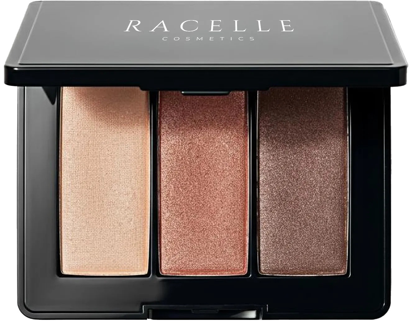 |
Prompt: A confident model stands poised within a bold and colourful boutique style studio setup, her outfit from Jules Collective — perfectly mirroring the space’s bold yet refined palette. Around her, neutral display racks hold curated statement pieces, and a central table showcases neatly folded apparel in an art-directed arrangement. Shot on a 50mm lens at f/4, the composition feels crisp, modern, and editorial — minimalism infused with youthful vibrancy and confident style. | Same workflow and process as the previous example. It did a solid job of matching the overall shape, texture, and fit. The lace pattern translated nicely across the bodice, and the lighting direction stayed consistent with the studio background. But fine details, like fabric density and hem texture, softened slightly in translation. The AI also took a few tries to register the exact silhouette correctly before the dress hung naturally on the model. Score: 9/10 At this level, the small imperfections are what stand out - the lace pattern blurred slightly, and the circular cut-outs didn’t match the exact shape of the real fabric. But these are details you only notice when you zoom in. From a campaign or ecommerce standpoint, the generation holds up remarkably well. It’s a good reminder that AI doesn’t need to replace photography to add value: it can visualise styling, test compositions, and accelerate creative approval long before a photoshoot happens. When used this way, it’s not a shortcut. It’s a head start. | 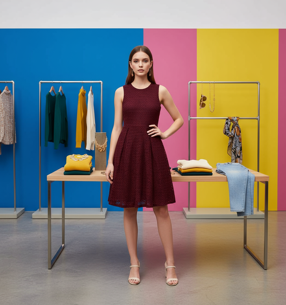 Product shot: 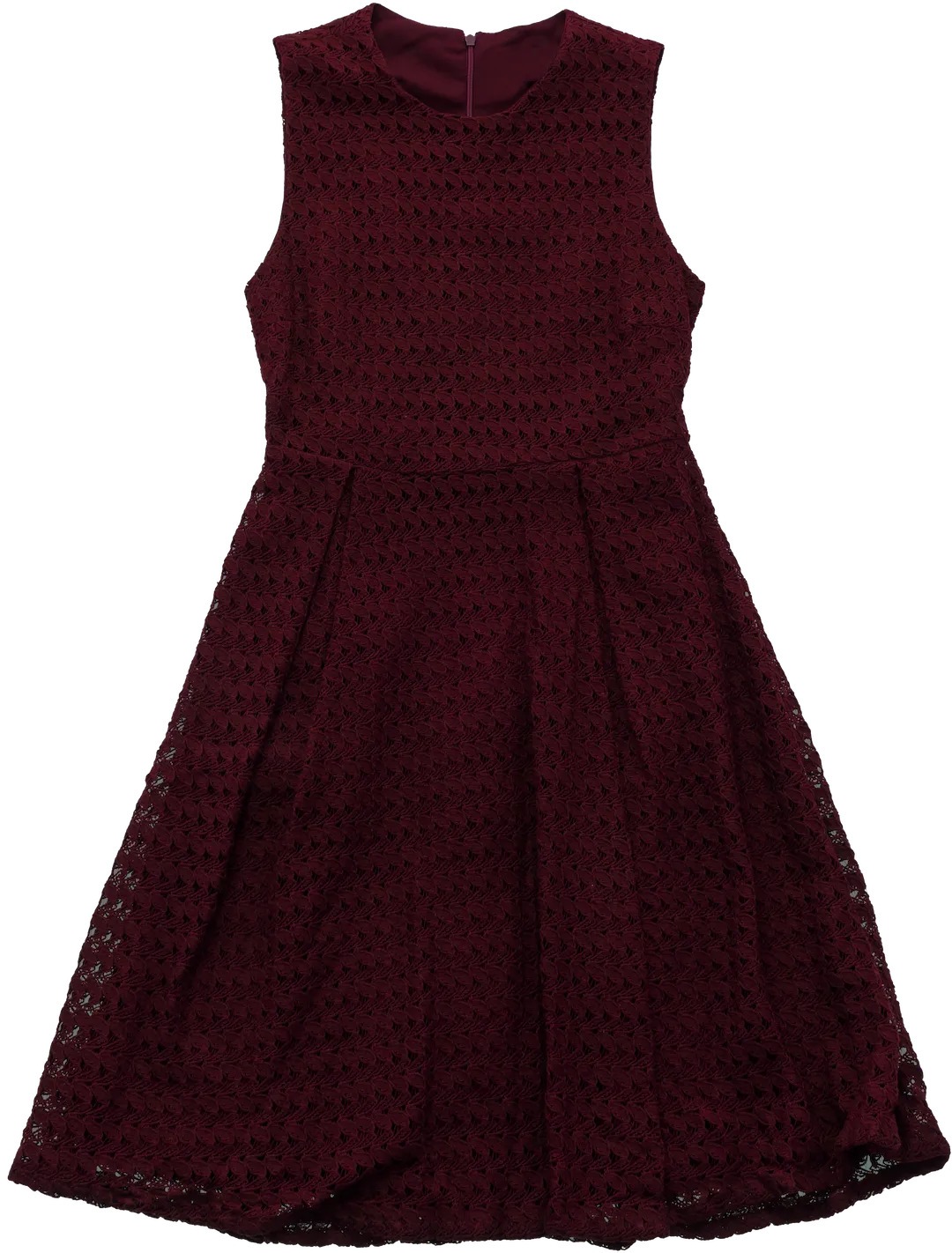 |
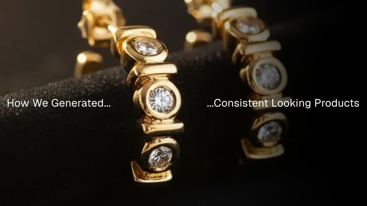
Prompt: A dark velvet surface serves as the backdrop, rich and tactile, catching warm ambient light that creates a sense of understated luxury. The lighting is softly directional, with delicate rim highlights outlining the metallic curves of jewelry pieces and catching gemstone facets with natural sparkle — never overpowering, always elegant. A shallow depth of field creates soft bokeh in the background, with a warm, creamy blur that complements skin tones and textile textures. The scene composition draws from Musa Jewelry’s brand tone: minimalist yet intimate, with a balance of golden-hour hues and soft shadows, showcasing earrings with refined simplicity. Shot at f/2.0 using a 100mm macro lens to emphasize surface textures and light-play across polished and matte finishes. | Jewelry is notoriously difficult, small shifts in lighting can flatten details or make metals look plastic. Yet here, the result feels polished and intentional. The reflections sit where they should, the gemstones catch just enough sparkle, and the velvet backdrop absorbs light softly, letting the gold take centre stage. The only tricky part was scale. Getting the earrings to sit naturally within the close-up frame took multiple adjustments, they either appeared too large for the velvet surface or too small to feel like the hero subject. Once balanced, though, everything else fell neatly into place. Score: 9/10 Jewelry reveals how much AI has learned to read light. The detail match was nearly perfect, every groove and gemstone reflection matched the product’s real structure with surprising precision. What Nano Banana still needs is a stronger sense of scale awareness in tight compositions. This test proved that for macro or tabletop photography, the AI performs exceptionally when the scene is clean, lighting is clearly defined, and the focus is on texture and tone. The lesson: if you feed it clarity, it returns elegance. | 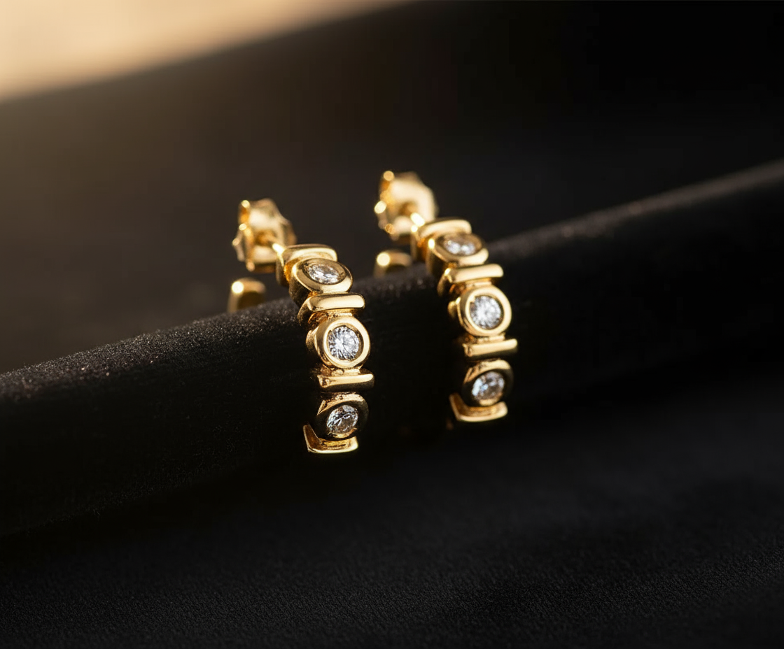 Product Shot: 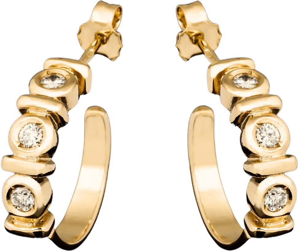 |
Prompt: A wooden beachside table captured at golden hour, bathed in warm, amber sunset light. Chilled cans of stout sit center frame, beads of condensation glistening under the sun’s fading rays. The lighting is natural and cinematic, casting long, soft-edged shadows across the textured wood. In the background, the ocean horizon is slightly out of focus, with gentle, blurred waves and a pink-orange gradient sky enhancing the mood. The overall tone draws from Tramonto’s brand cues — earthy warmth, handcrafted elegance, and sociable ambiance. Shot at 50mm f/2.0 for creamy bokeh, with a shallow depth that emphasizes the can’s label and texture while retaining a relaxed, editorial feel. | We wanted Nano Banana to remove the studio look of the original can and reimagine it in a lifestyle setting: beachside, warm, and cinematic. It partly succeeded. The tone and mood were beautiful, the lighting felt natural, and the condensation detail sold the realism. But the product fidelity fell short. The can appeared shorter than the original, the metallic rim shifted to green, and fine label details like “1856” and “Traditionally Brewed” distorted. The AI also struggled to fully remove the studio light reflections from the source image, leaving faint remnants on the can’s surface. Score: 6/10 AI does a great job of reading mood, but still struggles with material integrity. Metallic surfaces and printed labels are unforgiving, even small distortions are instantly visible. The bigger lesson here is about input, not output. A product photo lit for a studio environment rarely translates cleanly into a lifestyle scene. When the lighting direction, tone, or reflection doesn’t match the new setting, AI ends up fighting physics. If your goal is photorealism, always start with product shots that already share the same kind of light as your target scene. It’s less about how well Nano Banana performs, and more about how smartly you feed it context. | 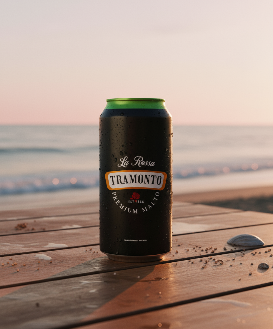 Product Shot: 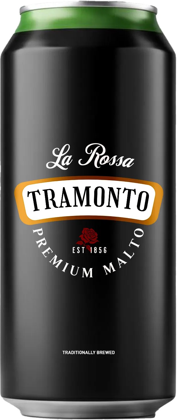 |
Prompt: A modern city street at golden hour, with soft blue and amber reflections bouncing off glass buildings and smooth concrete surfaces creating. A luxury sedan is parked slightly off-centre in the frame, its deep glossy paint catching the ambient hues from the surrounding skyline. Pavement tones and sky gradients blend naturally — warm streetlight glows contrast with the cooler evening blues. The composition is clean and editorial, evoking understated elegance. The car's silhouette is sharp yet subtle, with rim light edging the bodywork. Shot on a 50mm lens at f/2.2, low angle, with shallow depth to blur the background and emphasize the vehicle's refined lines. The tone and colour palette follow the Zephry brand: moody, balanced, and premium. | The goal was to move the Zephyr car from a neutral studio render into a real-world environment that conveyed mood, texture, and brand personality. The kind of scene that could sit comfortably in a lifestyle ad. Nano Banana interpreted the setup intelligently: the reflections and lighting felt cinematic, the street surface gleamed realistically, and the building reflections added depth. Even the slight camera reposition, shifting the car’s angle to better align with the environment, felt deliberate, almost art-directed. Where it stumbled was colour consistency. The original car’s tone was replaced by a bluer, more reflective hue that matched the prompt description rather than the real brand shade. The AI leaned too literally into the environmental palette, treating “blue and amber reflections” as a full recolour cue rather than lighting behaviour. Score: 8/10 This result shows how well AI understands form but still needs help with brand-locked colour logic. The geometry, reflections, and proportions held up beautifully, but maintaining colour accuracy requires clearer instruction, something like “retain exact car body colour” or providing an alpha-masked reference. Interestingly, Nano Banana’s creative autonomy here was almost useful. Its subtle camera and lighting decisions elevated the image beyond a simple composite. This is where AI’s potential feels closest to human art direction — it wasn’t just placing the car; it was interpreting mood. The next evolution would be colour discipline. Once the AI learns to separate lighting influence from material colour, outputs like this could go straight into production with little to no post-editing. | 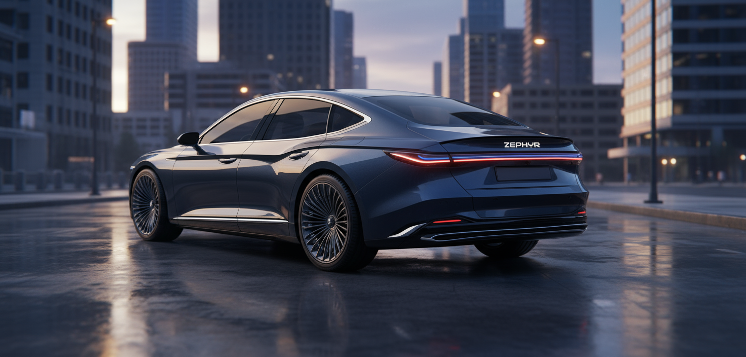 Product Shot:  |
Veo 3.1 image references with products and characters | After testing stills with Nano Banana, I wanted to see how Veo 3.1 would handle fidelity from product image to video gen. Could it keep the product true when everything else changes? Here are the results: Aura Cosmetics surprised me the most. The colour and tone stayed consistent, even the text details held up better than expected. The typography does warp slightly in motion, but on a phone screen, no one would notice. For a moving shot, that’s a small miracle. Score: 8/10 Racelle Cosmetics went off-script. Veo decided to imagine the inside of the product - beautifully, but completely invented. It’s a reminder that AI will fill in the blanks if you don’t give it the angle it needs. For strict brands, that’s a no-go. But the fidelity of the visible product stayed solid. Score: 4/10 Jules Collective made me laugh. The model’s dress kept its overall form, but Veo confidently redesigned the pattern at the bottom half. The funny thing is, it still looked good. The colours matched perfectly, and the upper half of the outfit felt true to the original. Score: 4/10 What I’ve learned from these motion tests is that AI holds fidelity best when you hold its hand. Give it the right angle, describe the light, and it’ll stay close to reality. Leave too much open, and it’ll start to “help.” Sometimes that help is inspired. Sometimes it’s couture. | |
Sign in or Join the community
Surprising you with what creativity can do.

Create an account
Surprising you with what creativity can do.
1
Comments (0)
Popular

Dive in
Related
Blog
Prompt-to-Product: Experimenting with Product Concepting Using Pencil
By Tim Bowers • Jul 24th, 2025 • Views 203
Blog
Reformatting your ads to any size in seconds with Pencil
By Tim Bowers • Nov 21st, 2025 • Views 406
28:11
Video
Webinar: Pencil in Practice - Approaches to Resizing in Pencil
By Tim Bowers • Nov 28th, 2025 • Views 155
Blog
Prompt-to-Product: Experimenting with Product Concepting Using Pencil
By Tim Bowers • Jul 24th, 2025 • Views 203
28:11
Video
Webinar: Pencil in Practice - Approaches to Resizing in Pencil
By Tim Bowers • Nov 28th, 2025 • Views 155
Blog
Reformatting your ads to any size in seconds with Pencil
By Tim Bowers • Nov 21st, 2025 • Views 406