There's a scene in almost every great film where you can feel the colour doing something. Not just looking nice, actually doing something. Changing how you feel about a character. Making a familiar place feel wrong. Taking a perfectly ordinary moment and making it feel like a memory, or a threat, or a dream.
That's not an accident. That's a colourist making a decision.
And it turns out, you can make that same decision in a prompt.
Colour grading is one of those things that gets talked about like it's post-production. Something that happens after the real work is done. A polish pass. A vibe adjustment.
It isn't that.
The grade is a narrative decision. It tells you what genre you're in before anyone says a word. It tells you how to feel about the characters before they do anything. A warm lifted look is one kind of story. Crushed blacks and drained skin is something else entirely. You already know the difference, you've been trained by every film you've ever watched. The model has been trained on all of them too.
Which means when you describe a colour treatment in your prompt, you're not giving a technical instruction. You're making a reference. To a shared visual language that the model already speaks fluently.
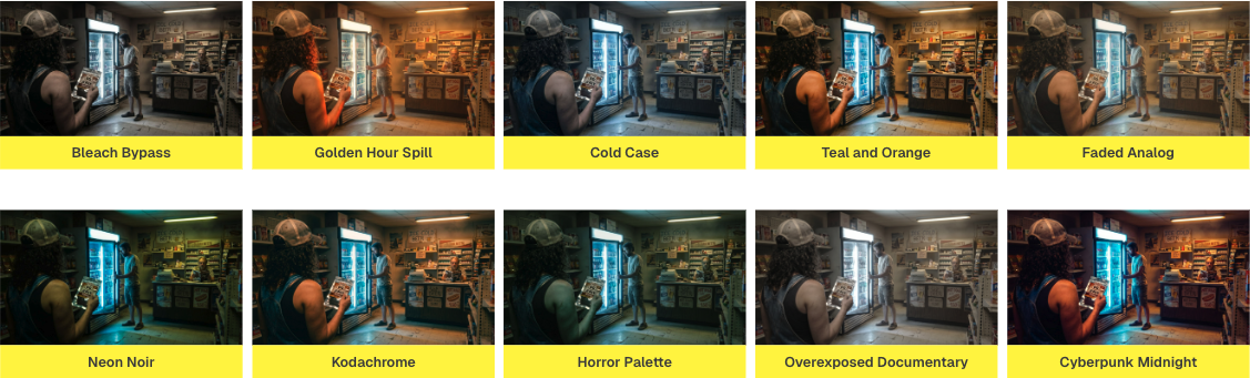
The model knows what Bleach Bypass looks like. It knows what Kodachrome feels like. It knows the difference between Teal and Orange and Neon Noir. You don't have to explain any of it. You just have to name it.
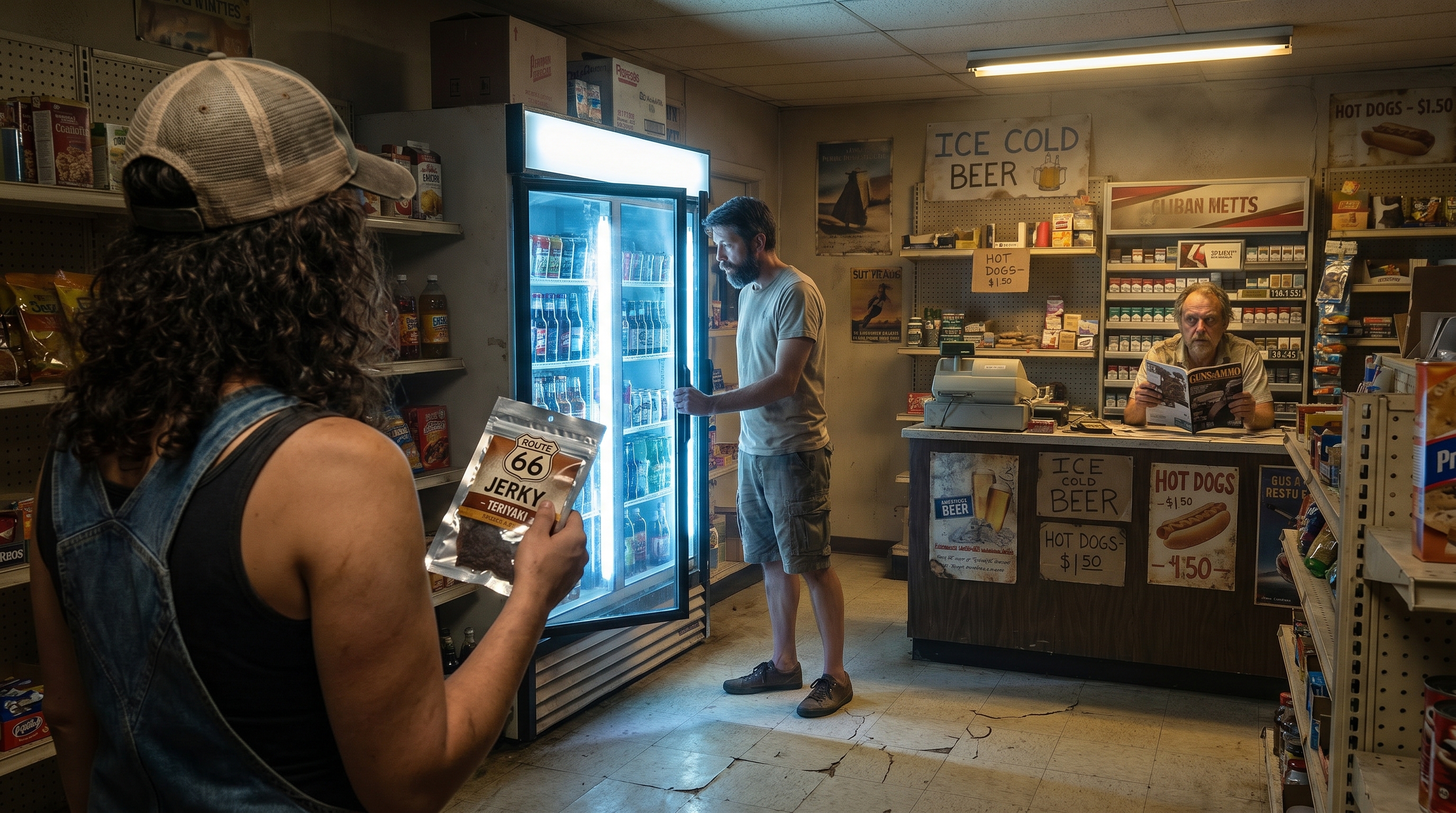
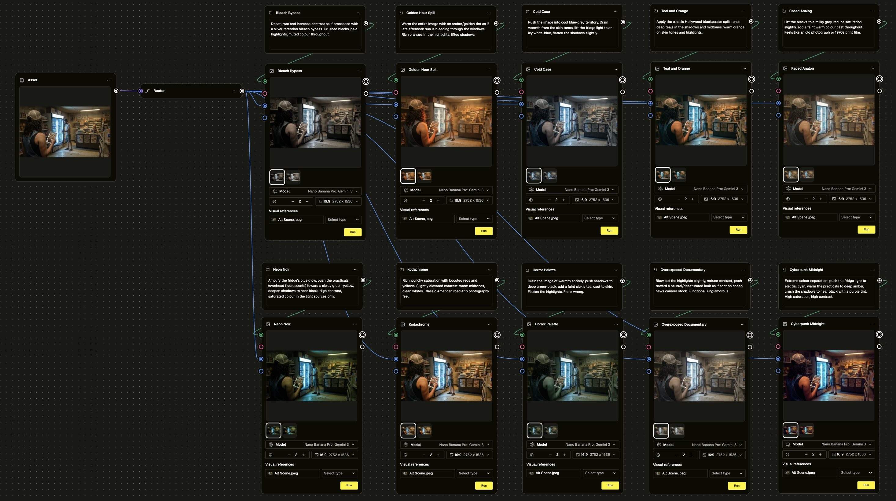
In this module, we took one scene and ran it through ten completely different colour grades in a single workflow. Same gas station interior. Same two characters. Same suspicious attendant in the background who, depending on the grade, reads anywhere from "mildly eccentric" to "genuinely concerning."
The scene didn't move. The light sources didn't change. The only variable was the grade named in the prompt.
Ten lines. Ten completely different feelings.
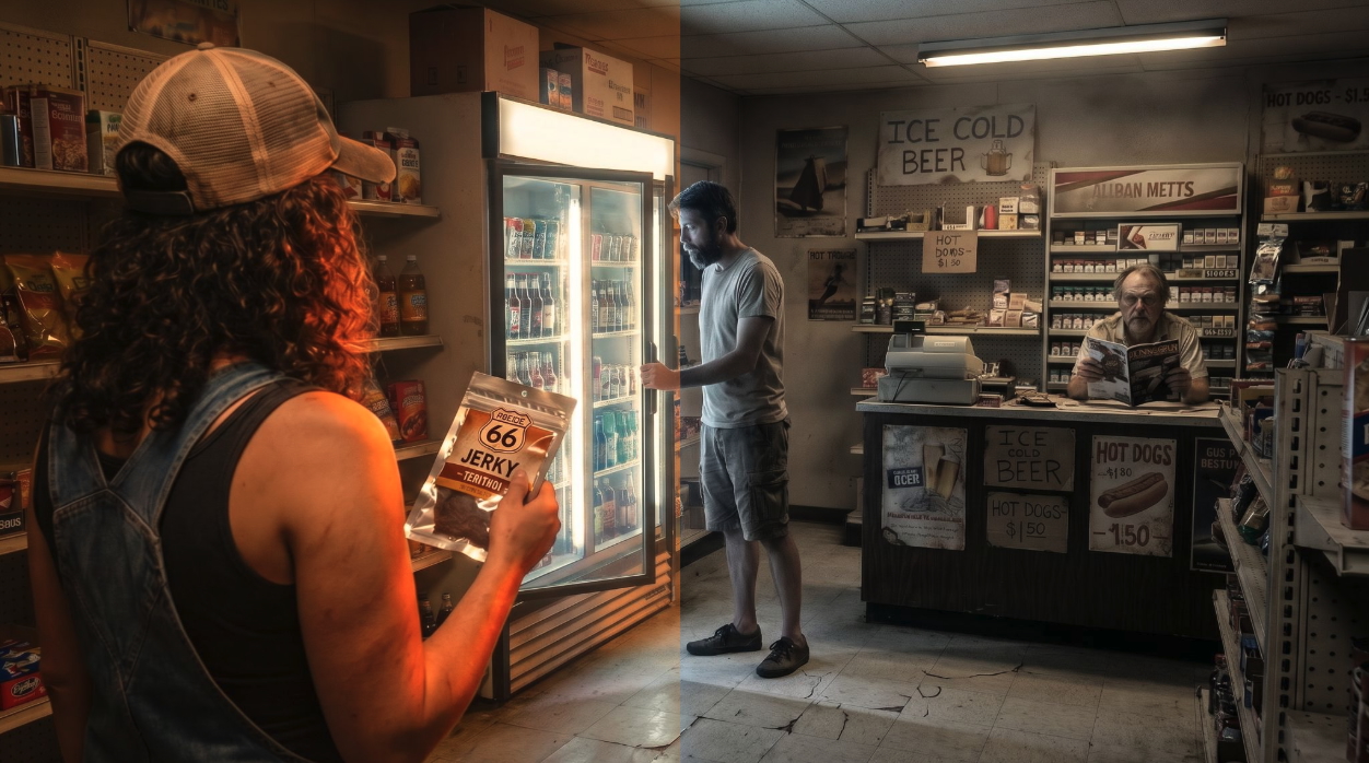
Bleach Bypass turned the whole thing into something tense and desaturated, like a scene from a psychological thriller where nothing has gone wrong yet but definitely will. Golden Hour Spill flooded the frame with warm amber, suddenly the same store feels like the last good day of summer. Cold Case drained the warmth out entirely and pushed the fridge light to an icy white-blue. The same attendant, the same fridge, the same two people - now it feels like something very bad happened here recently.
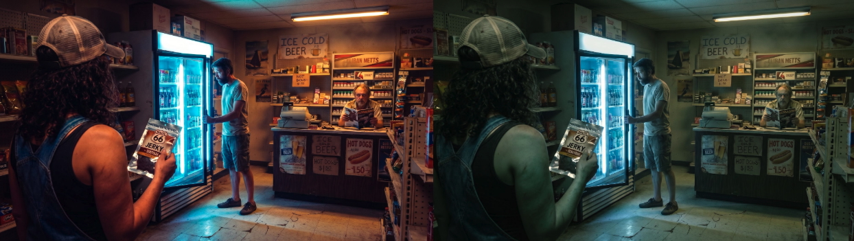
Neon Noir amplified the fridge glow into something electric. Horror Palette made the attendant look like he'd been expecting you. Cyberpunk Midnight turned the whole thing into a different decade entirely.
One scene. Ten worlds.
The workflow itself is straightforward, and that's kind of the point. One asset node. Ten prompt nodes, each with a different grading description. Ten generation nodes in parallel. You run it once and get everything back at the same time.
What you do with that is the interesting part.
Because here's the thing about running ten grades before you commit to anything: you find out what you actually want. Not what you thought you wanted, not what the brief said, not what you've always done - what this specific image, in this specific moment, actually needs to be. The grade that makes you stop scrolling is the one that's telling your story.
That's a creative direction tool. That's what colourists charge a lot of money to help you figure out. And you can run it in one workflow.
Go check out the module below and try it for yourself ->