We ran 12 real creative use cases through GPT Image 2.0 so you don't have to.
Emma Wilson
We spent the last few weeks running GPT Image 2.0 through 12 real creative production scenarios. Not dummy prompts. Actual advertising work; product ads, character composites, label accuracy stress tests, style transformations, format resizing. The kind of stuff creative teams actually get briefed on.
We built everything around a fake brand called Plaque Slayer. A punk-rock oral care brand with a full character universe, three SKUs, a brand book, and a tone of voice that sounds like a metal album. That gave us a real creative system to work within, rather than prompting in a vacuum.
The full breakdown of every use case is in the deck attached to this article. But here's the high-level picture of what we found.
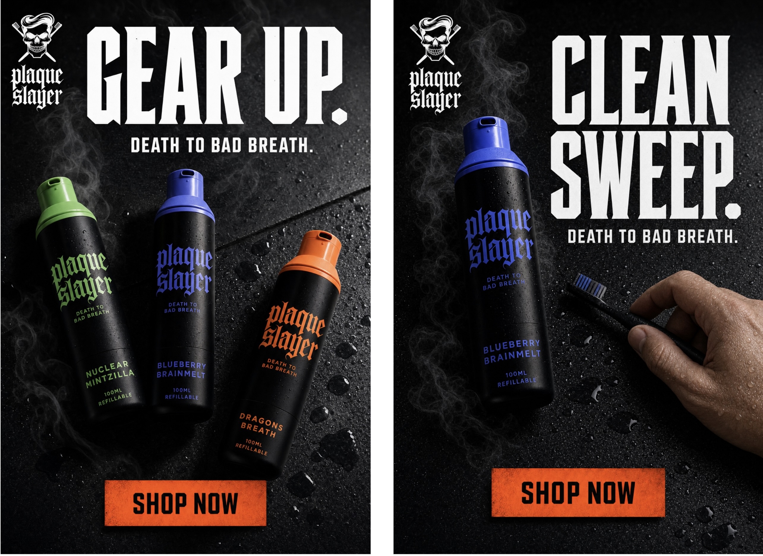
It can build layouts from scratch
We used GPT Image 2.0 to generate a two-page promotional flyer combining character art, product renders, logo, copy, and brand colours across both pages in a single workflow. We also generated a Facebook feed ad from a one-line brief. Three products, dark studio surface, gothic headline, CTA button. One shot. No design tool, no template. These aren't rough concepts either. They came out polished enough to actually present.
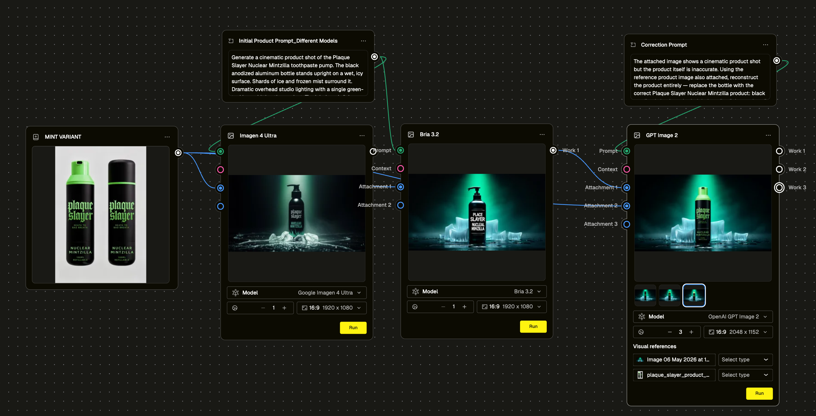
It handles product detail better than anything we've tested before
Product label accuracy has been the persistent headache with AI image generation. We ran a deliberate stress test. Generated the same scene using Bria 3.2 first, which hallucinated the label completely. Wrong text, wrong layout. Then fed that output into GPT Image 2.0 with a correction prompt and the correct product reference image attached. It fixed the product and left the scene intact. That's a repeatable workflow, not a lucky output.
We also ran the label through increasingly complex environments to see where it would break. It held up across studio shots, action scenes, and character composites. The consistency is genuinely different from what we've seen before.
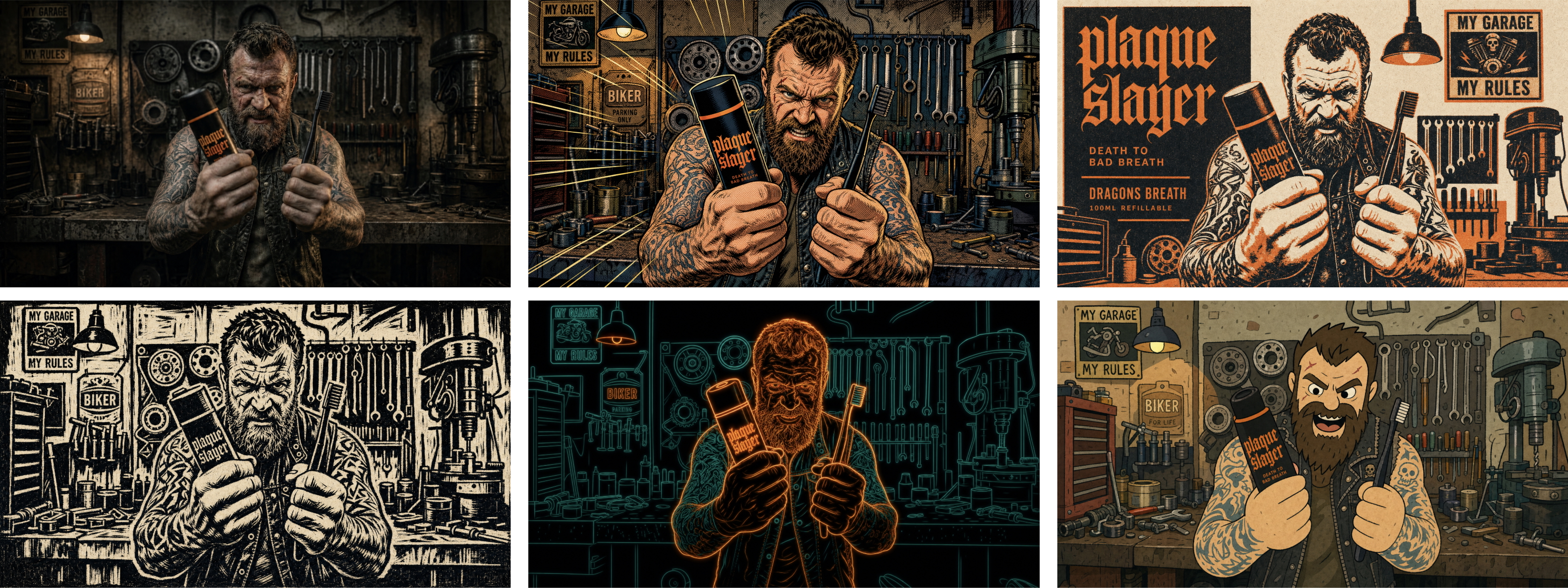
Style transformation is fast and flexible
We took one photorealistic garage mechanic scene and transformed it into five completely different styles off the same base image. Vintage comic book, risograph print, woodblock/linocut, neon line art, and loose indie animation. Each one held the product placement and brand recognisability while completely changing the visual language. For teams who need to adapt a hero asset across different creative territories without reshooting, this is genuinely useful.
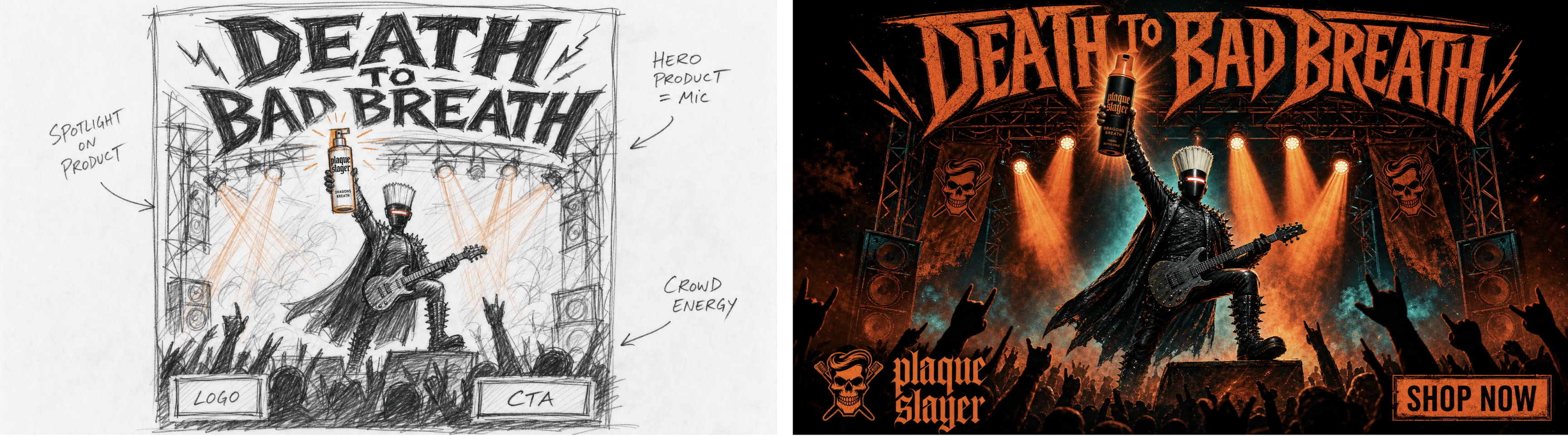
Sketch-to-image works as a creative starting point
We generated a rough CD-style wireframe sketch first (pencil marks, margin annotations, placeholder boxes) then fed it in as a layout brief. The output was a finished gig poster ad. The model interpreted the composition intent from a lo-fi input and rendered it cinematically. Good for early-stage creative development when you want to explore a composition without committing to a full production brief.
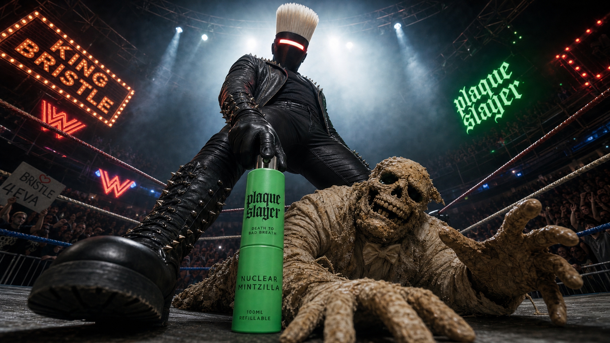
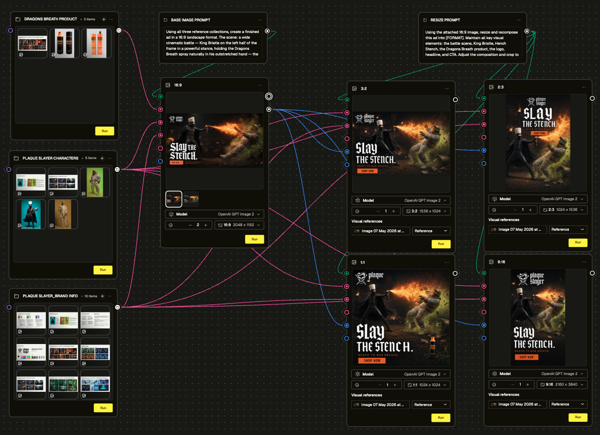
Combining multiple assets into a single composite is where it gets interesting
Use Case 9 was the most complex thing we ran. We took brand characters, a product, a logo, and a CTA button, and prompted GPT Image 2.0 to composite them into a finished battle scene ad across multiple format sizes. We organised the inputs into a Collection node structure grouped by product assets, character assets, and brand assets. Generated one master 16:9 image, then recomposed it into 1:1, 4:5, and 9:16 using a single resize prompt. The composition intent held across all sizes. Typography is the one area that will need a human eye; the model gets the style, not the exact font (but it does come pretty darn close!).
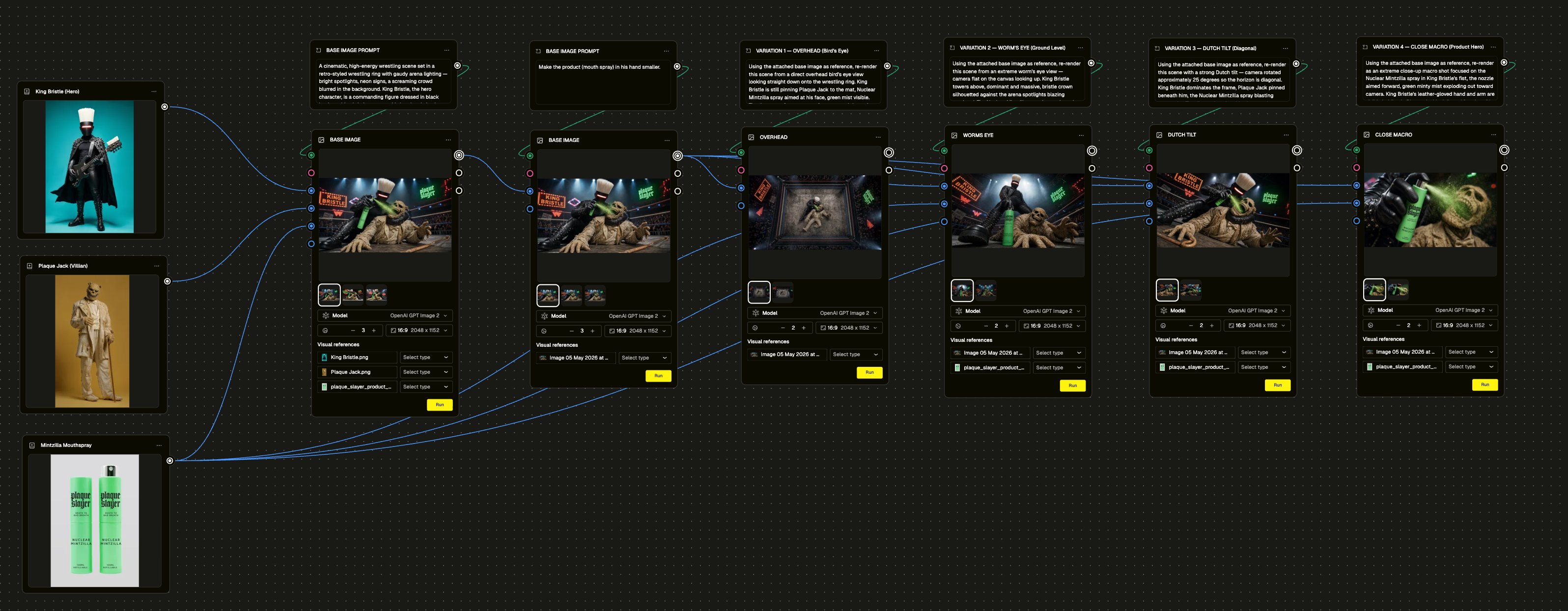
Camera angles, background swaps, and product replacement are quick iterations
Bread and butter operations for any creative team working with a product range. We tested all three. Camera angle shifts on the same scene, background swaps without touching the product, product replacement with colour variation across flavours. They all worked with short, specific prompts and clean reference images. The consistent finding: attach the product reference image as a node rather than describing it in text. Visual reference wins every time.
It can give a finished ad a second life
We took a locked, signed-off Facebook feed ad and refreshed it with a single prompt. Solo hero product instead of the trio, new headline, one added compositional element. Same creative DNA, completely different feel. No rebuild. For teams managing a content calendar across a long campaign, that matters.
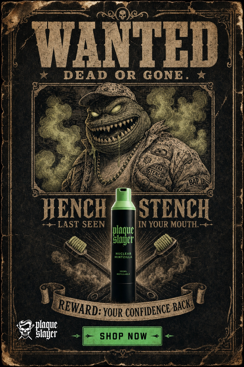
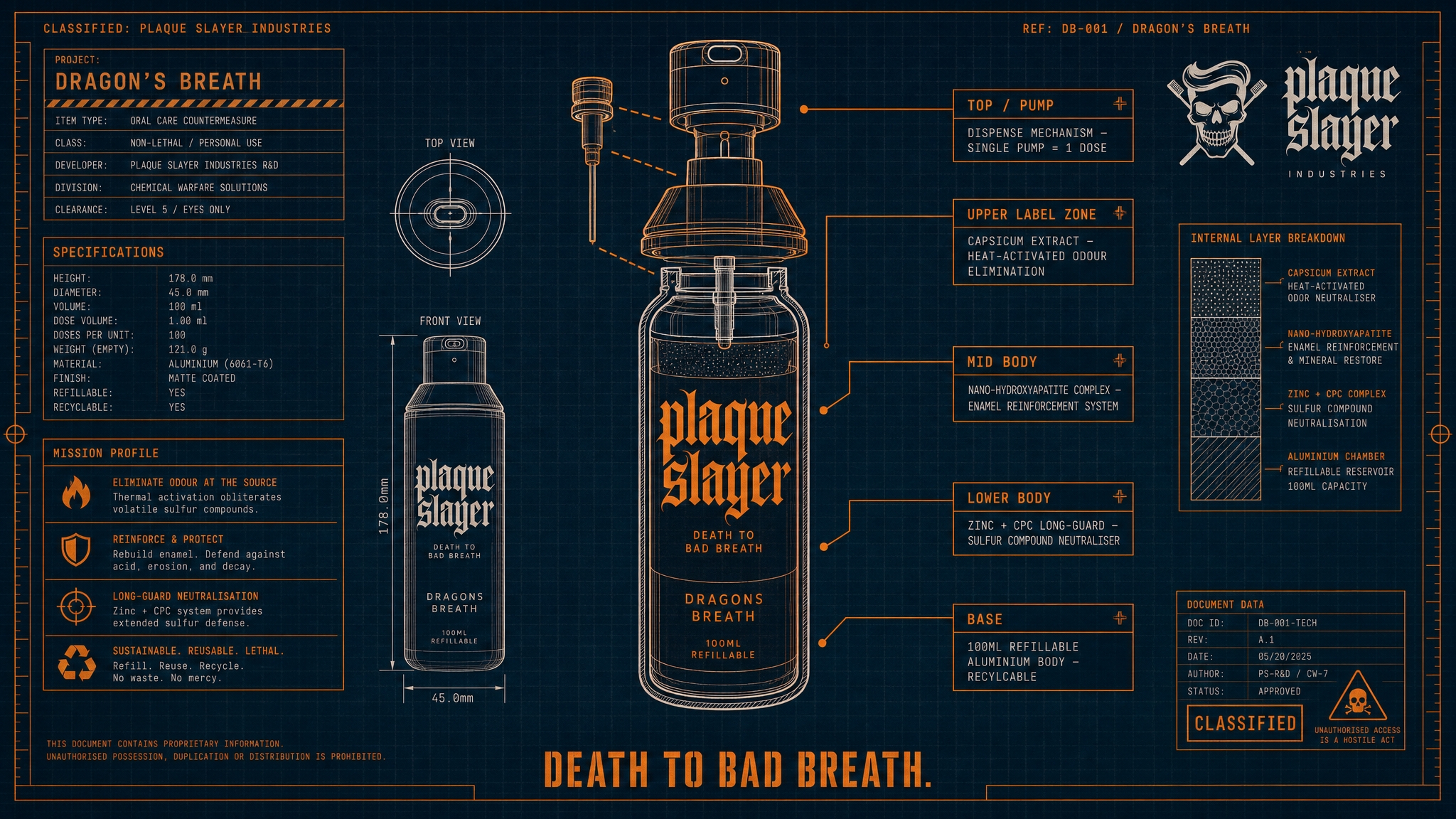
The infographic use case was a surprise
We tested three completely different design styles on the same product: a fighter profile stat card, a weapons blueprint, and a Victorian apothecary label. The weapons blueprint was the standout. It reads like a classified R&D document, with exploded diagrams, callout lines, and technical annotations for each part of the bottle. Genuinely on-brand in a way that felt considered, not lucky. All three came out finished enough that you'd have a hard time believing they were simply generated from a prompt.
The big takeaway
GPT Image 2.0 is not a replacement for creative direction. You still need to know what you want and brief it like a creative director would brief a photographer or illustrator. The difference is the speed of iteration and the breadth of what's possible in one session. We went from brief to finished ad set in workflows that would have previously required multiple tools, multiple people, and multiple rounds of feedback. One thing to flag: font replication isn't exact yet. The model interprets typeface style from a reference rather than loading the actual font, so outputs will get close but may need a typography pass before they're truly on-brand.
The deck attached goes through every use case in detail with the actual prompts, workflow setups, and generated outputs. If you want to get into the specifics of how we ran any of these, it's all in there ⬇️⬇️⬇️